A well-placed A-frame sign can lift foot traffic by 30 to 50%. That number holds up because the message sits at eye level, right where someone decides whether to walk in, instead of buried three clicks deep on a website. This guide rounds up A-frame sign ideas proven to work in practice, not just in a mockup.
Most sidewalk signs never get that chance: faded chalkboard specials nobody can read from the curb, a generic “OPEN” sign that says nothing about what’s actually inside, one board propped up back in January and never touched since. A sign that hasn’t changed since your last renovation isn’t a sign anymore. It’s furniture.
The businesses getting real results treat their A-frame the way they’d treat a top-performing ad: they test the messaging, refresh it seasonally, and design for a five-second glance from someone walking or driving past.
This guide covers why A-frame signs still beat flashier, pricier options, walks through five proven design approaches, and runs the math on the return from a sign that costs less than a week of digital ad spend.
Why A-Frame Signs Work
A-frame signs work because they meet people exactly where buying decisions happen: at eye level, on the sidewalk, seconds before someone chooses whether to walk in. A billboard gets a glance from a moving car. A digital ad gets scrolled past in half a second. An A-frame sits three feet from the front door, close enough that the message and the decision happen almost at once.
They’re also cost-effective in a way few other channels are. A quality sign is a one-time cost measured in hundreds of dollars, not the thousands per month that digital billboards or paid social campaigns demand, and it keeps working every day it sits on the sidewalk. Panels swap out, copy changes in minutes, and seasonal promotions go up without calling a vendor.
AT THE POINT OF DECISION
An estimated 75% of impulse purchases are influenced by signage at the point of decision.
For walk-in businesses like cafés, boutiques, salons, and restaurants, that makes it one of the most direct foot traffic strategies available to a small business. Most of them leave it sitting unused on the sidewalk.
5 A-Frame Sign Ideas Proven to Work
The best-performing signs aren’t random. They follow a handful of patterns that consistently earn a second look, and whether you call it an A-frame or a sandwich board, good sandwich board design usually comes down to one of five approaches. Here are the five A-frame sign ideas we see driving the most foot traffic, and what makes each one work.
01 / HIGH-CONTRAST COLOR
High-Contrast Color (Black + Neon)
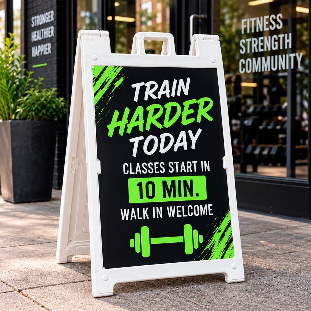
On a cluttered block, a matte black background with one neon accent color (hot pink, electric green, safety orange) wins before anyone even reads the words. The eye registers contrast before it processes text, so this style wins the “does it get noticed” fight first and the “what does it say” fight second.
A boutique fitness studio might run a black A-frame with neon-green lettering: “CLASS STARTS IN 10 MIN. WALK IN.” Next to the softer pastel and wood-tone signs typical of that block, it’s the one thing that actually interrupts a busy street. Gyms, salons, nightlife venues, and anything selling energy or urgency tend to get the most out of this approach.
02 / MINIMALIST TYPOGRAPHY
Minimalist Typography
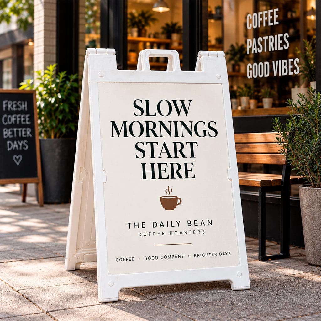
Not every business wants “loud.” A single bold word or short phrase in clean, oversized type, with plenty of white space and one accent color at most, signals quality and confidence instead of a hard sell. A specialty coffee roaster might run a sign that just says “SLOW MORNINGS START HERE” in a heavy serif, nothing else on the panel.
Premium and lifestyle brands do well here (wine bars, design studios, high-end salons), where a screaming sale sign would undercut the brand. It works through restraint. On a block full of busy, over-designed signs, the quiet one is what people remember.
03 / HUMOROUS OR WITTY MESSAGING
Humorous or Witty Messaging
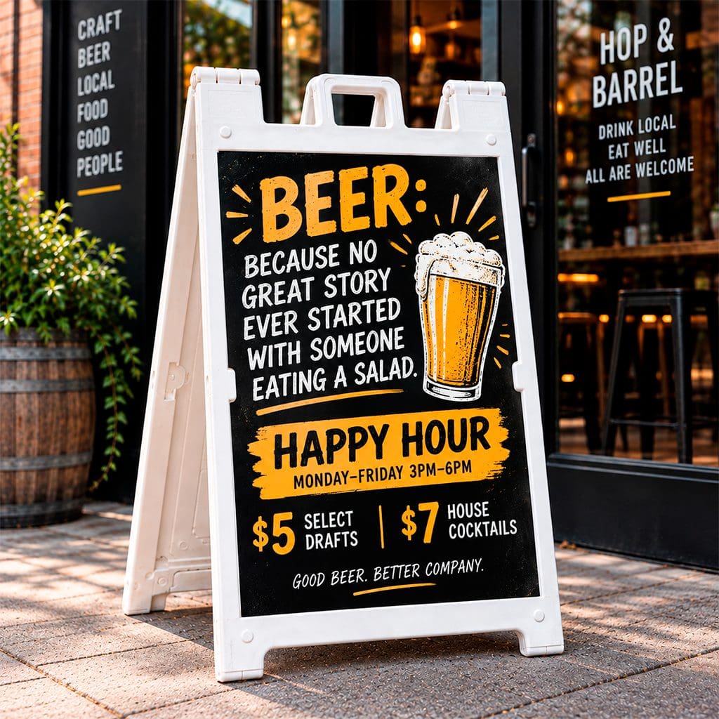
A genuinely funny line does something a discount can’t: it makes people stop, read it twice, and sometimes pull out their phone to take a picture. A brewery running “BEER: BECAUSE NO GREAT STORY EVER STARTED WITH SOMEONE EATING A SALAD,” or an ice cream shop with “WE’D SCREAM FOR YOU TOO,” turns a sidewalk sign into a tiny shareable moment instead of just information.
This style asks for upkeep; a joke goes stale fast for regulars walking past it daily. But for restaurants, bars, and personality-driven retail, a witty A-frame earns the kind of word-of-mouth and social shares that a plain “10% OFF” sign never will.
04 / SEASONAL OR PROMOTIONAL
Seasonal or Promotional
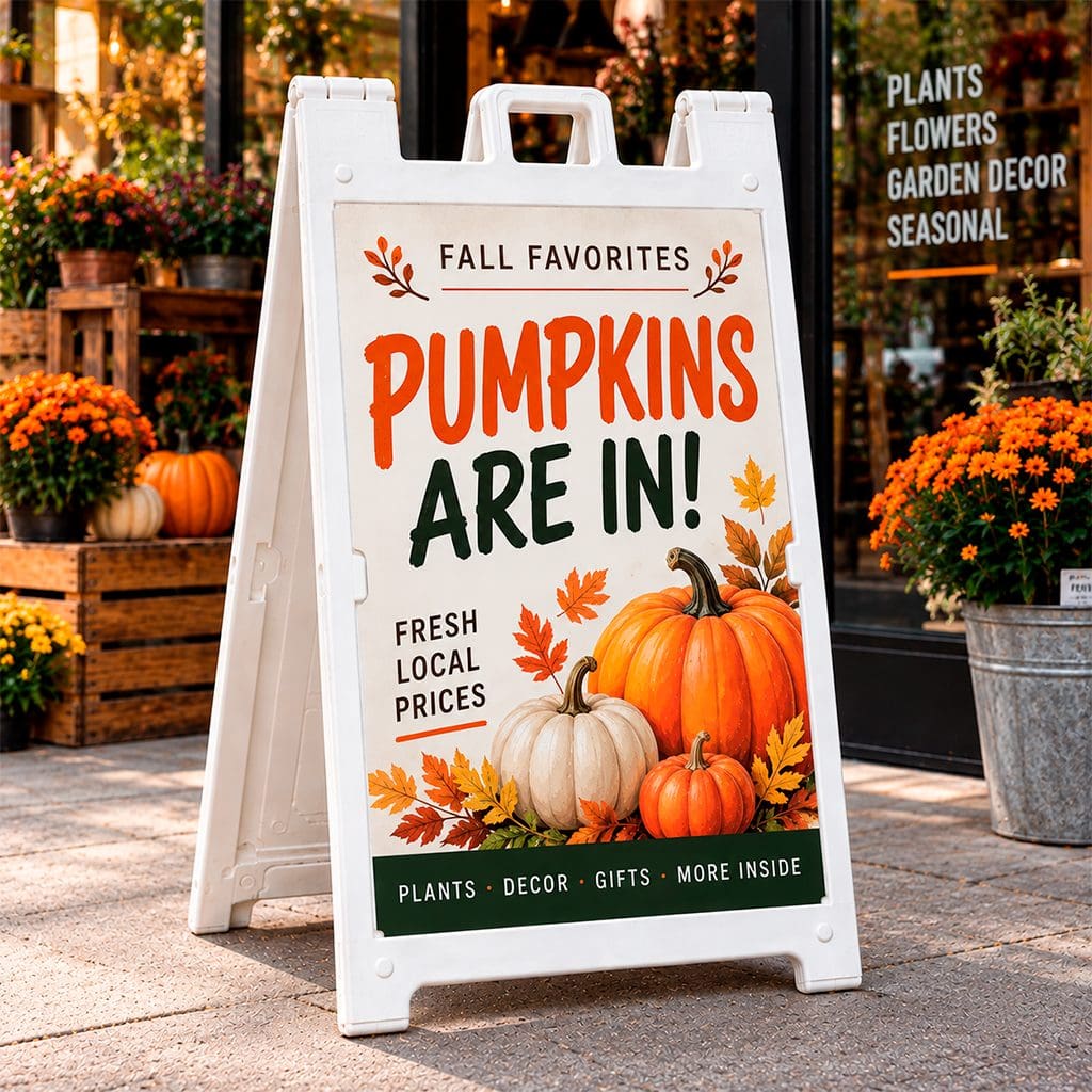
Change the sign with the calendar, and it tells passersby the business is paying attention, which matters more than most owners realize. A garden center that swaps “PUMPKINS ARE IN” for “FRESH-CUT TREES, $10 OFF THIS WEEK” is promoting more than a product. It tells the neighborhood the place is worth checking back on.
Retailers who commit to a seasonal or monthly refresh see the biggest lift from this style, because regulars start watching for what’s changed. Leave it untouched, and it fades into the background by week two. Keep changing it, and people glance every time they walk by, just to see what’s new.
05 / QR CODE + CTA
QR Code + CTA
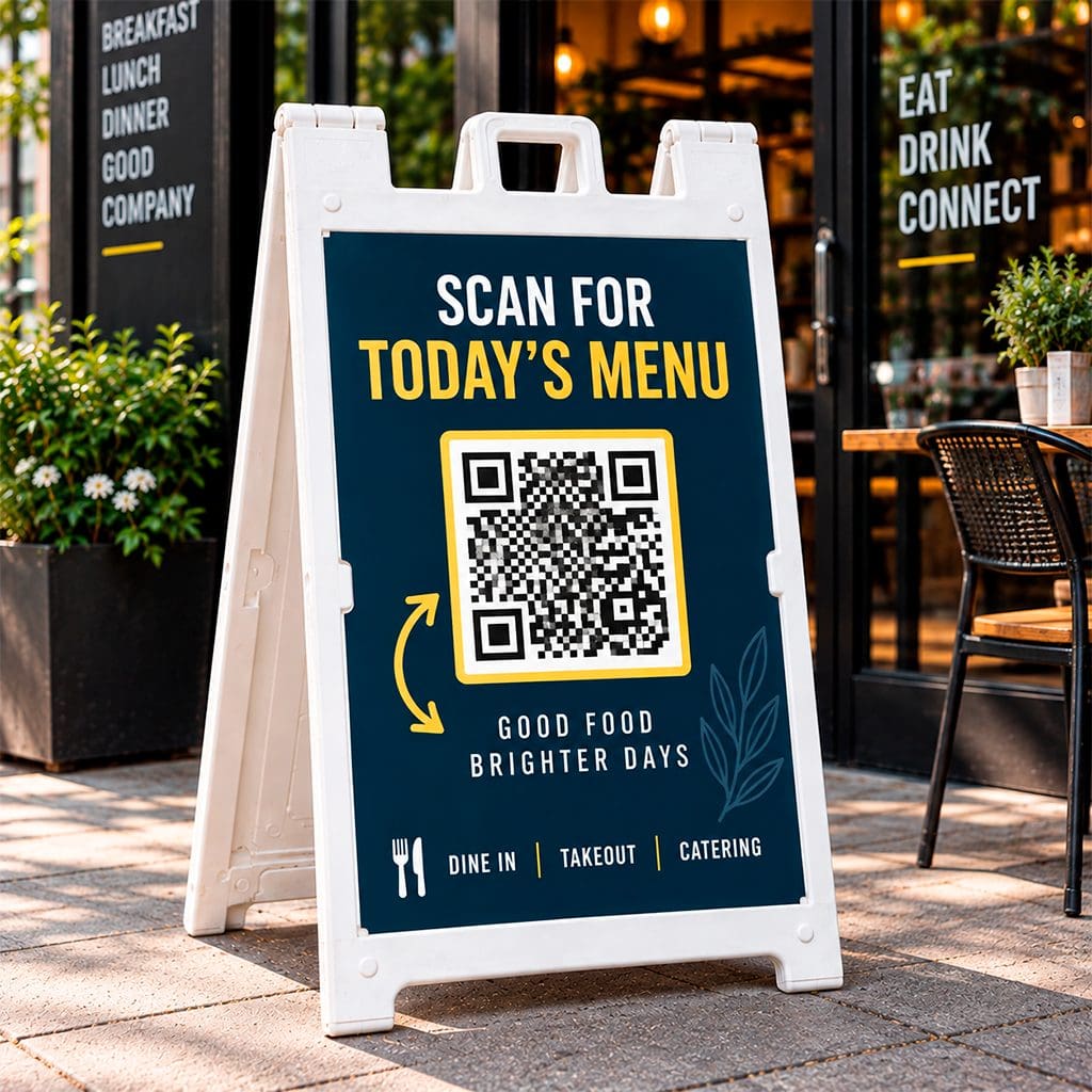
This pattern is built for the sidewalk-to-smartphone handoff. Pair a clear call to action, “SCAN FOR TODAY’S MENU” or “SCAN TO BOOK YOUR SPOT,” with a prominent QR code, and a passive sign becomes a trackable one. A restaurant linking straight to same-day reservations, or a service business linking to an instant quote form, closes the gap between noticing the sign and becoming a lead in a single scan.
The real advantage is measurability. Point the code at a dedicated landing page, and the number of scans becomes a real, countable metric. That makes it one of the few pieces of offline advertising with real digital attribution.
More A-Frame Sign Ideas by Business Type
The five approaches above cover the biggest design decision, but the right A-frame sign idea still depends on what you’re actually selling. A few starting points by category:
RETAIL & BOUTIQUES
Lead with a single hero product or a limited-time markdown, photographed or illustrated large enough to read from the curb, with the price as the second-biggest element on the panel.
RESTAURANTS & CAFÉS
A rotating “today’s special” panel works harder than a static menu; pair it with a photo or hand-lettered illustration of the dish, since food sells faster on emotion than on price.
SALONS, SPAS & GYMS
Booking-focused A-frame sign ideas perform best here: a specific time slot (“2PM OPENING TODAY”) or a QR code straight to your booking page turns a passerby into an appointment before they’ve kept walking.
REAL ESTATE & OPEN HOUSES
A clean directional sign with the address, time window, and agent contact in a strict size hierarchy gets more drive-by stops than a busy sign trying to sell the listing too.
PROFESSIONAL OFFICES
Restraint matters most here. A single line of text and your logo, in your brand colors, signals credibility better than a loud promotional design ever will.
Design Best Practices
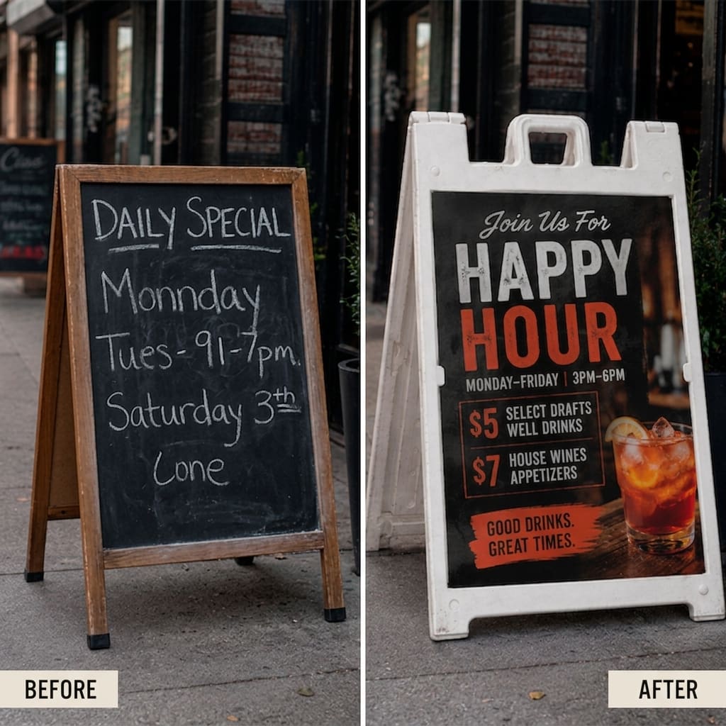
Whatever A-frame sign ideas you’re working from, retail signage design comes down to four fundamentals.
01 / READ IT FROM A DISTANCE
Legibility first.
Letters need to be at least 2 inches tall to read comfortably from 20 feet away. Your headline should run bigger still, 3 to 4 inches, so it registers from across the street and not just the sidewalk edge.
02 / CREATE CONTRAST
Color and contrast.
Dark text on a light background (or the reverse) reads fastest. Skip similar-value pairings like red on black; they look bold in a mockup and wash out in direct sunlight. Warm colors tend to signal urgency and food; cool colors read as calm and trustworthy, so choose based on what you’re actually selling.
03 / ONE SIGN, ONE MESSAGE
Message hierarchy.
One sign, one message. The strongest hook, a specific offer, product, or time window, goes in the largest type. Everything else (hours, address, fine print) gets smaller and sits below it. Say five things at once, and the sign says nothing.
04 / BUILD FOR OUTDOORS
Weather-resistant materials.
Fading and warping after one rainstorm undercuts everything above it. UV-resistant inks, wind-rated frames, and laminated or corrugated rigid signage panels hold up; plain cardboard doesn’t, not for a sign that lives outside daily.
How Much Can an A-Frame Sign Cost?
The cost of an A-frame sign depends on the frame size, printing configuration, quantity, and turnaround time. At 215 Prints, a current Plastic A-Frame Sign configuration starts at $139, with the final total changing as you adjust options. Each order includes one reusable plastic frame and two printed 4mm White Coroplast sign panels.
Three frame options are available, depending on how much display space you need. The Deluxe Sidewalk Sign holds 24″ × 36″ graphics, the smaller MDX Sidewalk Sign uses 18″ × 24″ graphics, and the Quik Sign® Sidewalk Sign holds 24″ × 18″ graphics. All three use replaceable Coroplast inserts, so you don’t have to replace the frame every time your promotion changes.
THINK BEYOND THE INITIAL COST
That replaceable-panel design matters for long-term cost. A restaurant can switch from a happy-hour promotion to a weekend special, a retailer can swap seasonal campaigns, and a real estate office can replace messaging while keeping the same frame.
For businesses that update their sidewalk advertising regularly, the more useful comparison isn’t the sign’s initial price—it’s how many campaigns the same frame can support.
View Plastic A-Frame Sign pricing and options at 215 Prints →
Real ROI Data
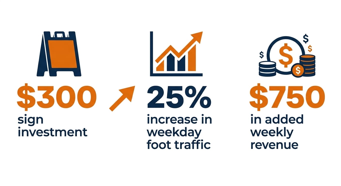
The math on A-frame signs is almost unfair, in the best way. Picture a neighborhood coffee shop that puts $300 into a new A-frame promoting a weekday specials board, a scenario close to what similar businesses have reported. Weekday foot traffic climbs 25% within the first month.
Work the numbers: the shop sees roughly 100 walk-in customers on a typical weekday, with an average ticket of $6. A 25% lift adds 25 customers a day, five days a week, or 125 extra transactions weekly, close to $750 in added revenue. Even after the cost of goods, that covers the $300 sign well inside the usual 2-3 month payback window, often faster.
Annualized, that same sign contributes thousands in incremental revenue for a one-time cost. Run the same math against your own ticket size and daily traffic; the pattern tends to hold across most walk-in businesses. Very few marketing dollars work this hard, this consistently, for this little upfront cost.
A great A-frame sign isn’t decoration. It’s a five-second sales pitch, positioned exactly where the buying decision gets made. Whichever A-frame sign idea fits your storefront, the principles hold regardless of style: get noticed with contrast or clean typography, keep the message legible from 20 feet, lead with one clear offer, build it to survive the weather, and refresh it often.
Businesses seeing 30-50% lifts in foot traffic are the ones running their A-frame sandwich boards like a real marketing channel, because that’s exactly what they are.
PUT YOUR SIDEWALK TO WORK
Ready to put a sign like this outside your own door?
Get a custom A-frame sign quote today, and we’ll help you design one that earns a second look.