First impressions form fast, and a business card is often the only part of you that leaves the room after a handshake. Good business card design turns that small rectangle into a reminder people want to keep.
This guide covers why cards still matter, current design trends, what separates professional business cards from forgettable ones, and the mistakes that cost you connections.
Why business cards still matter
Digital contacts are convenient, but they can’t replace handing someone something real. MOO’s 2012 survey of 1,007 American respondents, conducted by Ipsos, found that 78% of small business owners and 67% of the general population agreed the business card remains critical to successful networking.
The survey is over a decade old, but a card still sits on a desk or in a wallet as a reminder, while a name saved to a phone gets buried.
THE BUSINESS CARD REALITY CHECK
78%
of small business owners surveyed agreed business cards remain critical to successful networking
88%
widely cited estimate for business cards discarded within a week, published by Adobe in 2016
Reciprocity helps too. Offering your card invites the other person to offer theirs, which turns a pitch into a two-way exchange.
The odds deserve a look, though. A widely cited figure from Adobe (2016) estimates that 88% of business cards are discarded within a week. The same article says the most common reason, at 63%, is simply that the recipient doesn’t need the service at that time.
That makes timing important: a card may need to stay useful and memorable until the recipient actually has a reason to call.
Timing and first impressions decide whether it survives. Aim for a card worth keeping until they do need you, which is what well-made custom business cards are for.
The handoff counts as much as the card. Give it over at the end of a good conversation, while the exchange is fresh, so it works as a bookmark for that moment.
Echo what you talked about, such as your specialty or a clear one-line description, to help them remember why they wanted it.
Modern design trends
Modern business card design doesn’t have to be loud. Four approaches are worth considering:
01 / KEEP IT CLEAN
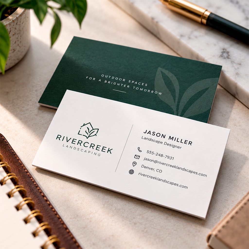
Minimal layouts
Generous white space, a larger name, and only the details someone will actually use.
02 / USE COLOR WITH PURPOSE
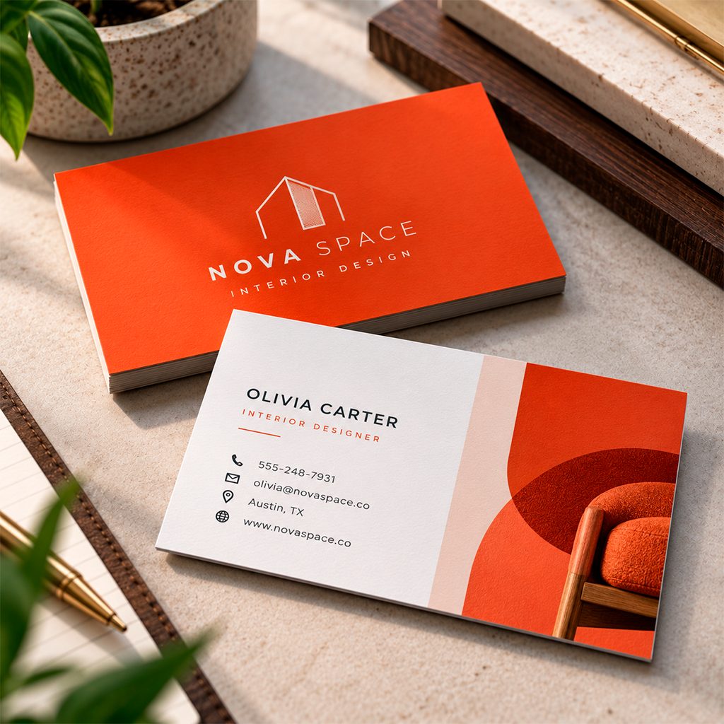
Bold color blocking
A full-bleed brand color on one side makes a card easy to spot in a stack, especially when paired with a clean white or neutral reverse.
03 / ADD TEXTURE
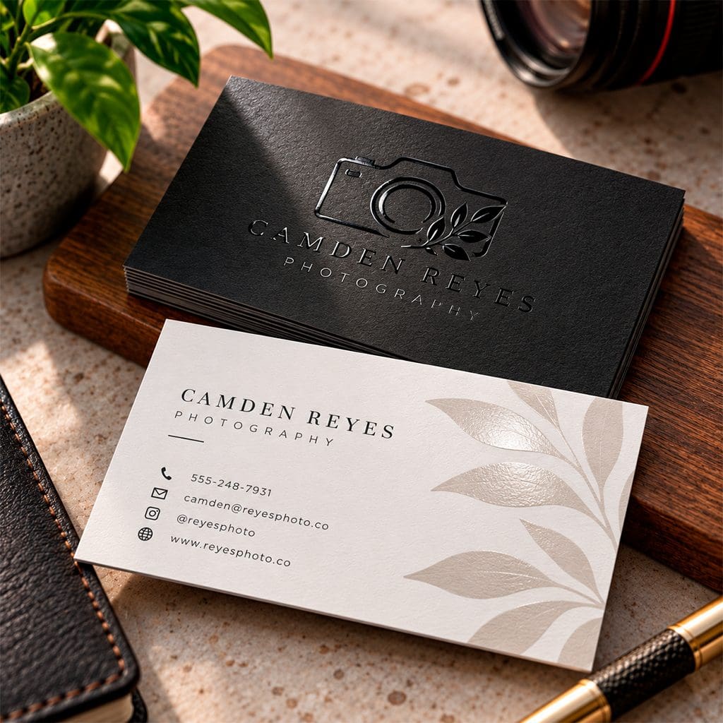
Tactile finishes
Matte coatings and spot UV accents add texture you can feel before anyone reads a word.
04 / CONNECT PRINT TO DIGITAL
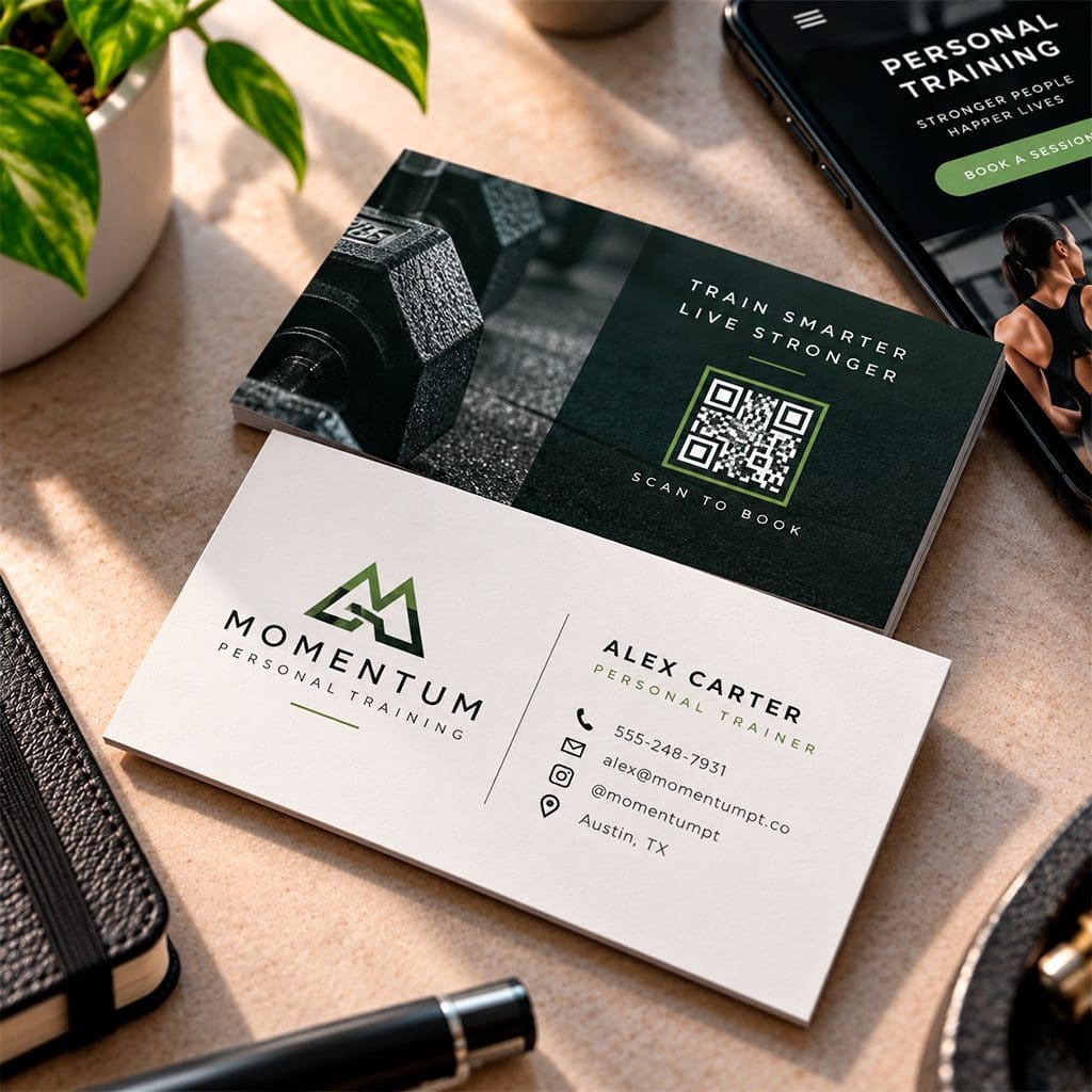
Scannable backs
A QR code linking to your portfolio, booking page, or contact file connects the handshake to your website. The reverse side also works well for a short offer.
Business card design best practices
These details make professional business cards look intentional, not improvised.
01 / THE FOUNDATION
Materials and size
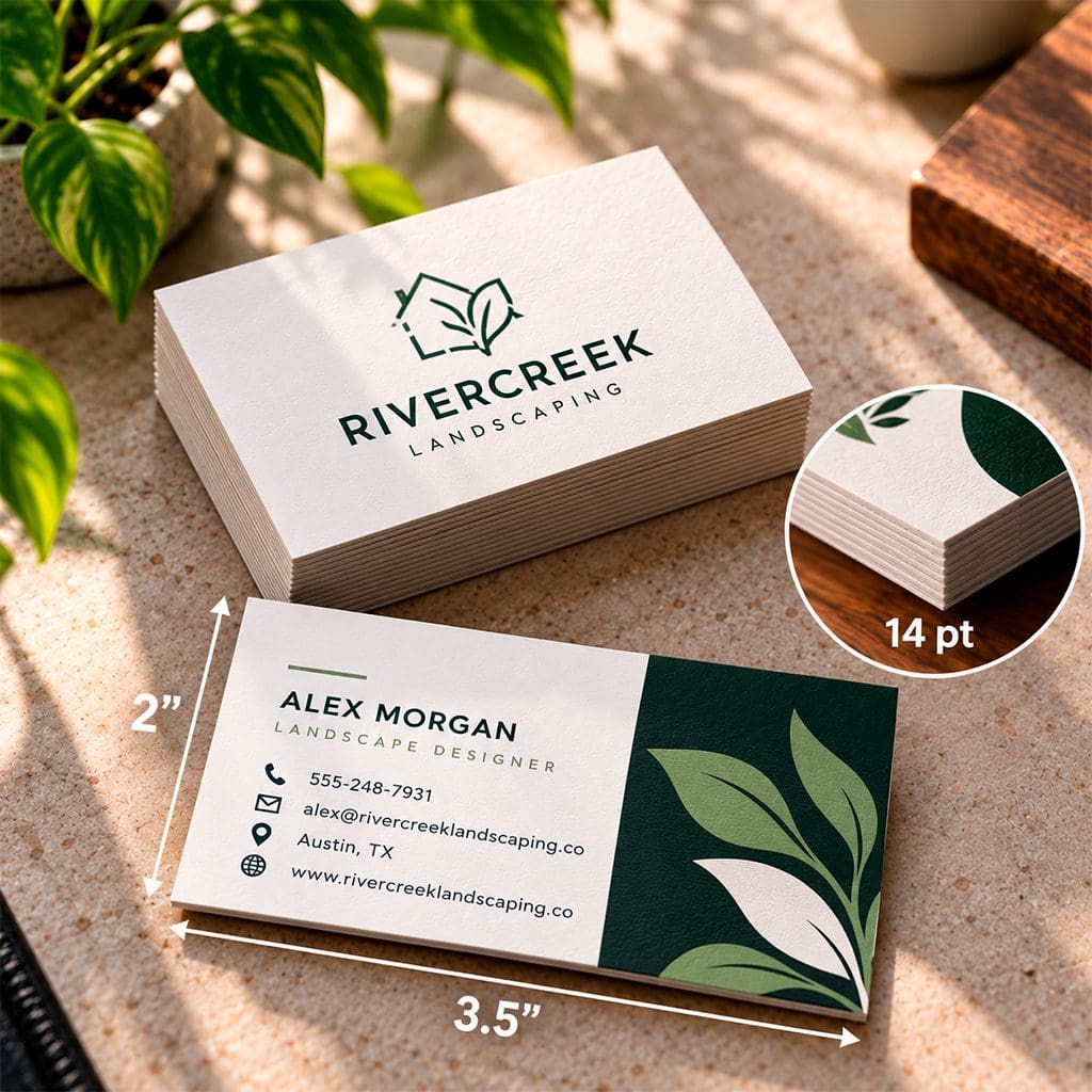
The standard 3.5″ x 2″ format fits wallets and card holders, and 14 pt cover stock is a common, dependable starting weight. Heavier stock feels sturdier in the hand.
02 / KEEP IT CONSISTENT
Color
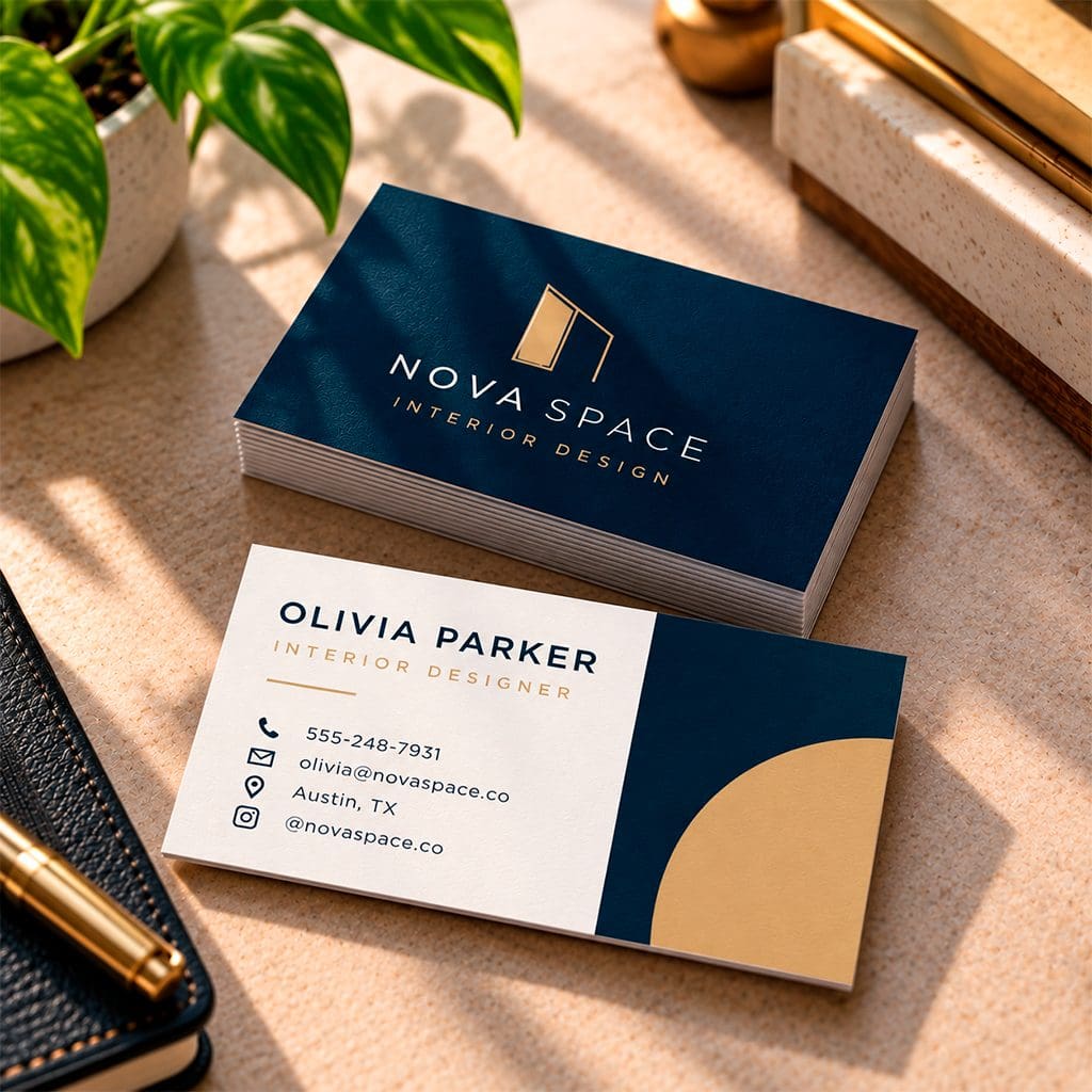
Stick to two or three brand colors and keep strong contrast between text and background. Screens glow, and paper doesn’t, so request a proof before a large run.
03 / MAKE IT READABLE
Typography
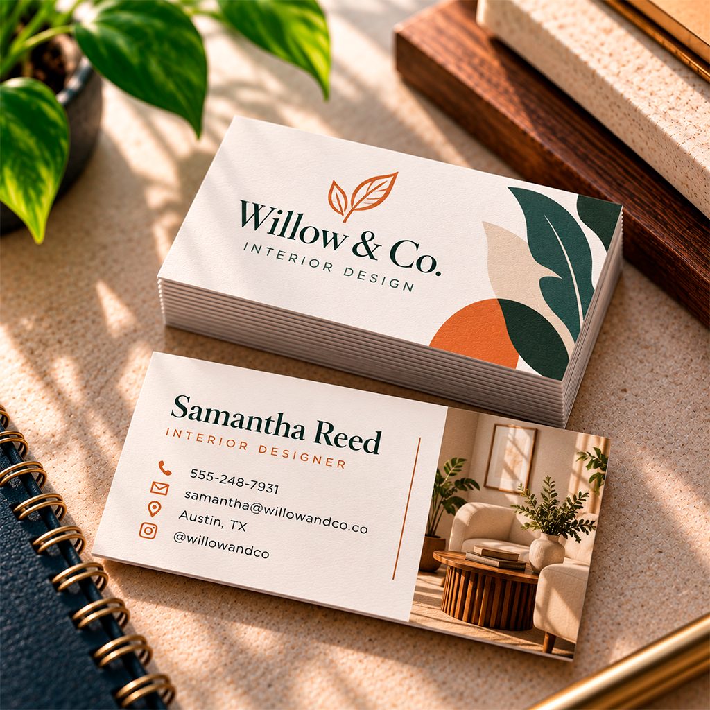
Use one or two typefaces, keep your name the largest element, and make sure contact details are easy to read at arm’s length. If you have to squint on screen, it will be worse in print.
04 / CREATE A CLEAR PATH
Layout
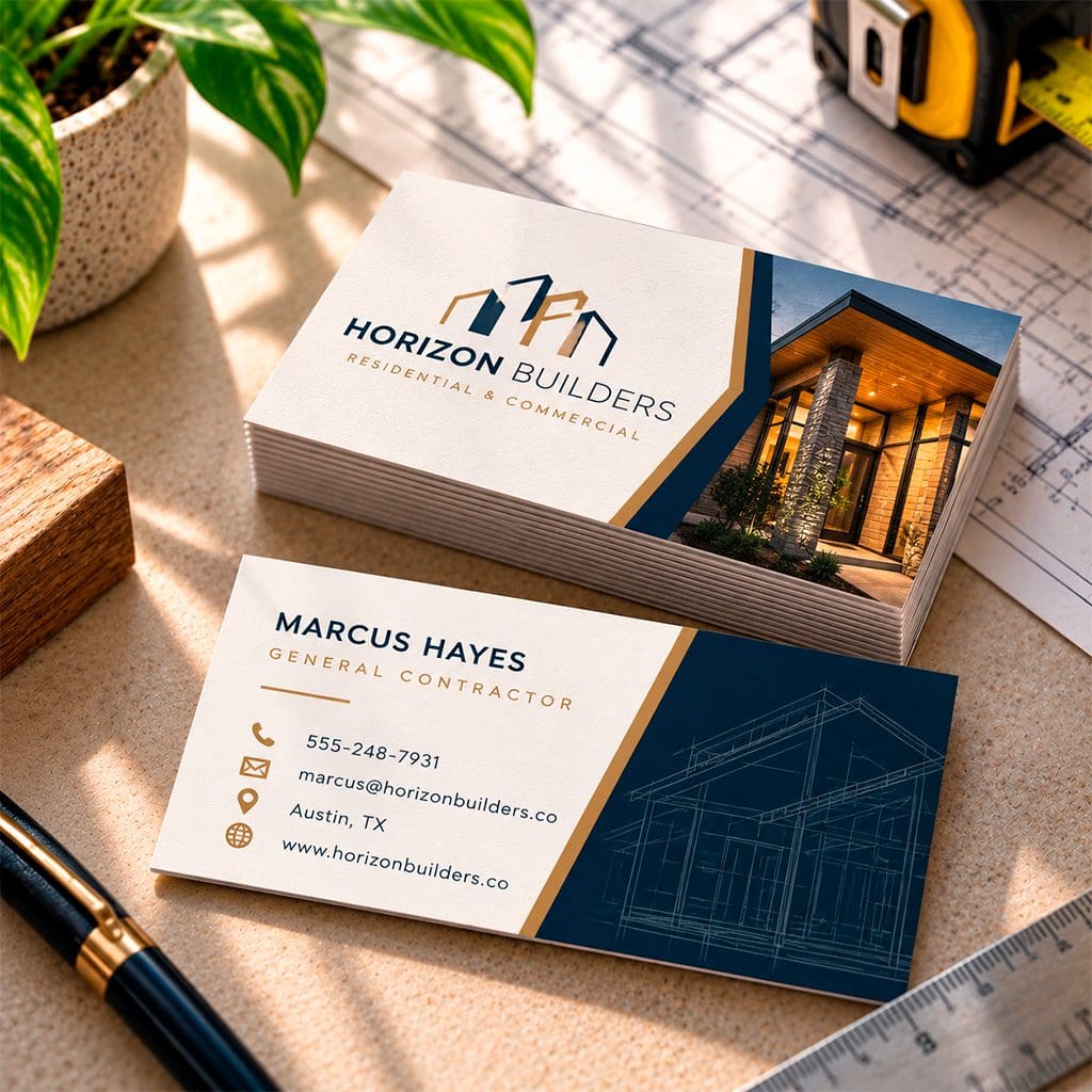
Put the essentials in a clear order: name, title, then the one or two ways you most want to be reached. Keep the logo simple and leave breathing room around everything.
05 / CHOOSE FOR THE USE
Finish
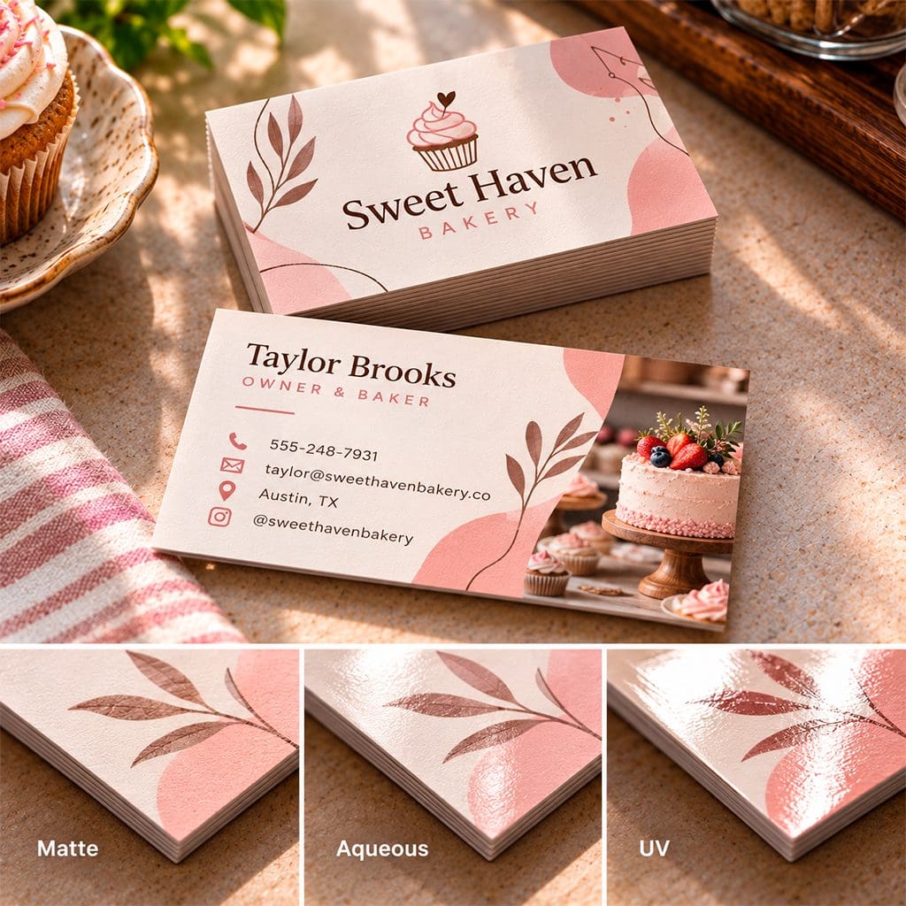
Coating changes both a card’s look and its use. Aqueous coating adds a slight shine and more vivid color, UV hi-gloss adds protection but isn’t suited to writing on, and matte or uncoated stock is easy to write on.
Match the finish to what you sell: a bakery and a law firm shouldn’t share the same card.
Common mistakes to avoid
A strong layout can still be undone by a few avoidable errors:
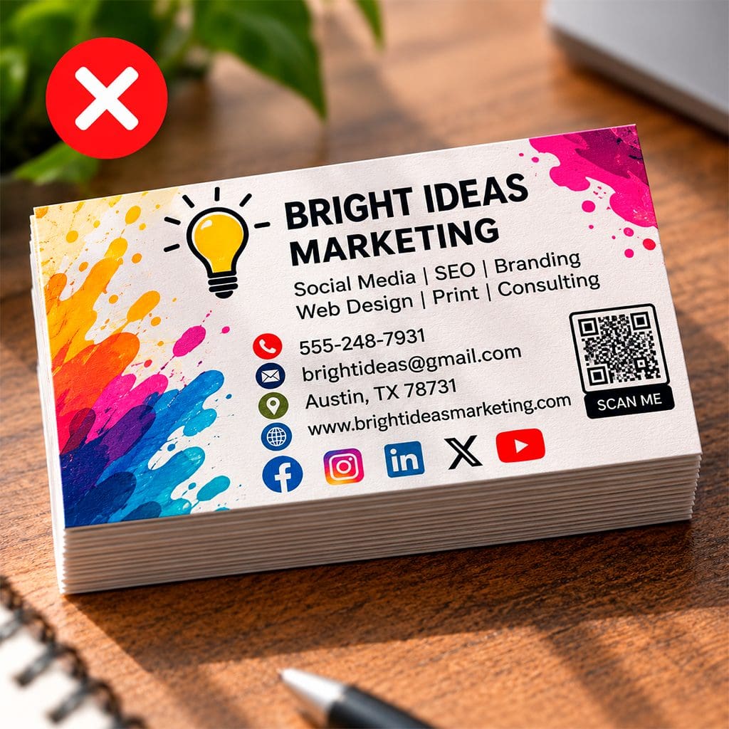
Overcrowding
Ten links and a slogan compete with each other, and none wins.
Too much information makes it harder to see what matters first. Prioritize your name, role, brand, and the contact method you actually want people to use. Move secondary links and details to a QR code or website instead of competing for space on the card.
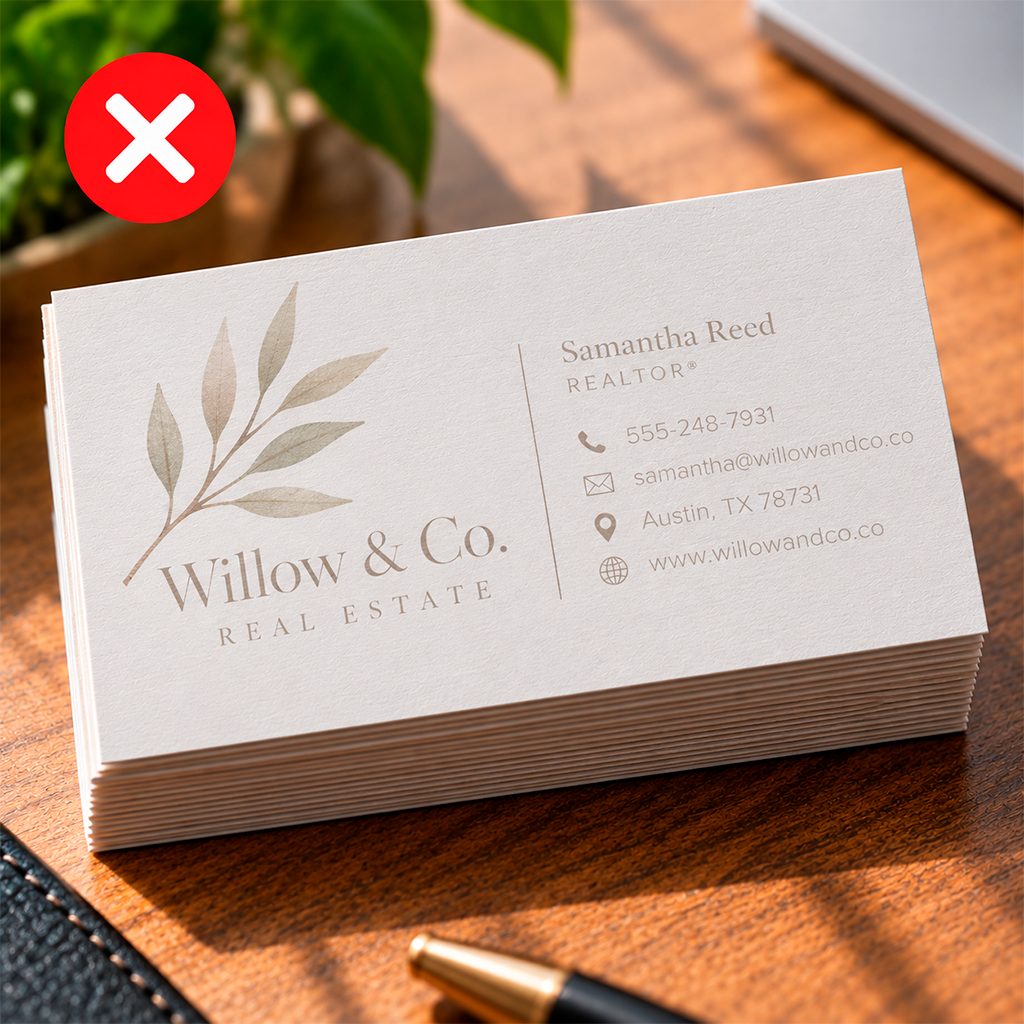
Tiny or low-contrast type
Light gray on white looks elegant on a monitor and unreadable in a dim room.
A design can look clean on a bright monitor and become difficult to read once printed at 3.5″ × 2″. Keep contact details comfortably legible and check the contrast between the type and its background, especially when using light colors, thin fonts, or text over photography.
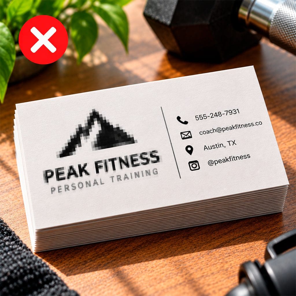
Low-quality artwork
A pixelated logo undercuts the professionalism you’re paying for.
A pixelated logo or blurry image is especially noticeable on a small, professionally printed piece. Use vector artwork for logos whenever possible and high-resolution files for photos or graphics so edges, fine details, and typography reproduce cleanly.
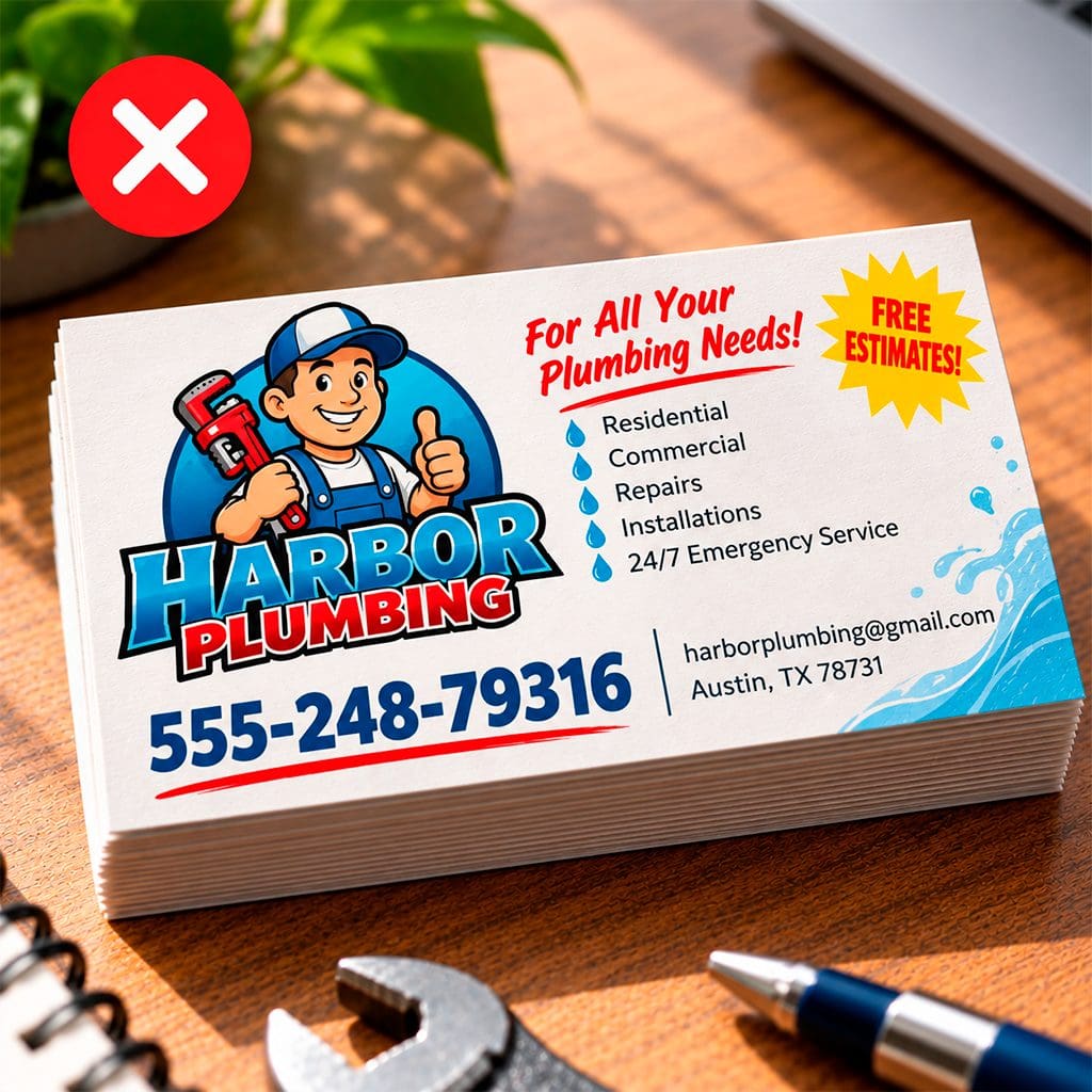
Outdated or unproofed details
One wrong digit in a phone number makes the whole card useless.
A beautiful card becomes useless if the phone number, email, URL, title, or QR code is wrong. Proof those details separately from the design, and scan the printed QR code before committing to a larger run.
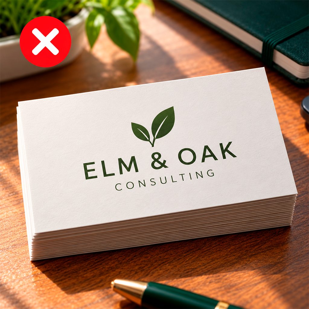
No next step
A card that lists information without inviting action gives people nothing to do.
Contact information tells someone how to reach you, but not necessarily why they should. Give the card one relevant next step—book a consultation, request a quote, view recent work, or redeem an offer—so the recipient has a clear reason to act after the conversation.
The fix for most of these is the same: proofread twice, order a proof, and hand the draft to someone who has never seen it. If they can’t tell you what you do and how to reach you within five seconds, simplify.
Template options
Templates speed up business card design without making you look generic. Pick a structure, then swap in your logo, colors, and copy to create custom business cards that still feel like yours.
Three reliable starting points:
01 / TRADITIONAL
Classic
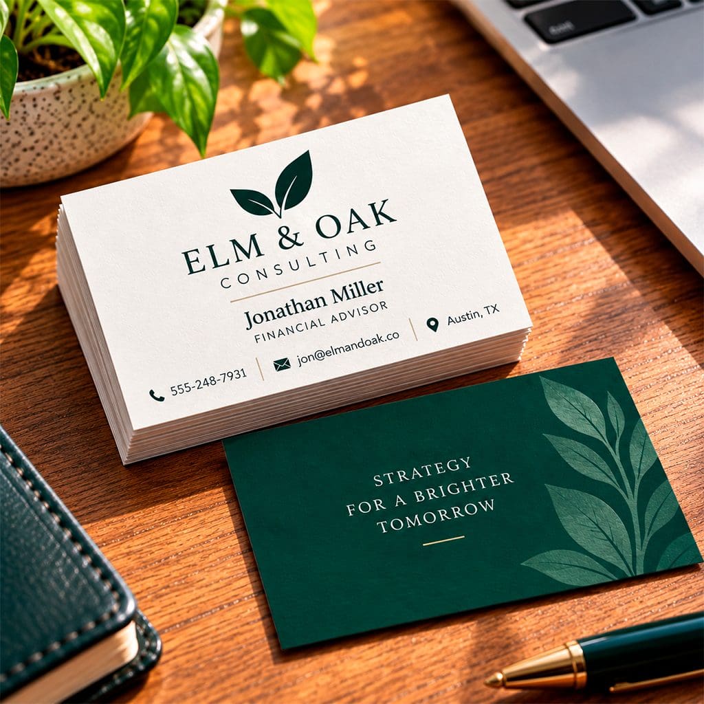
Centered logo, name and title beneath, contact details grouped at the bottom. Suits accountants, financial advisors, and consultants.
02 / HIGH IMPACT
Bold
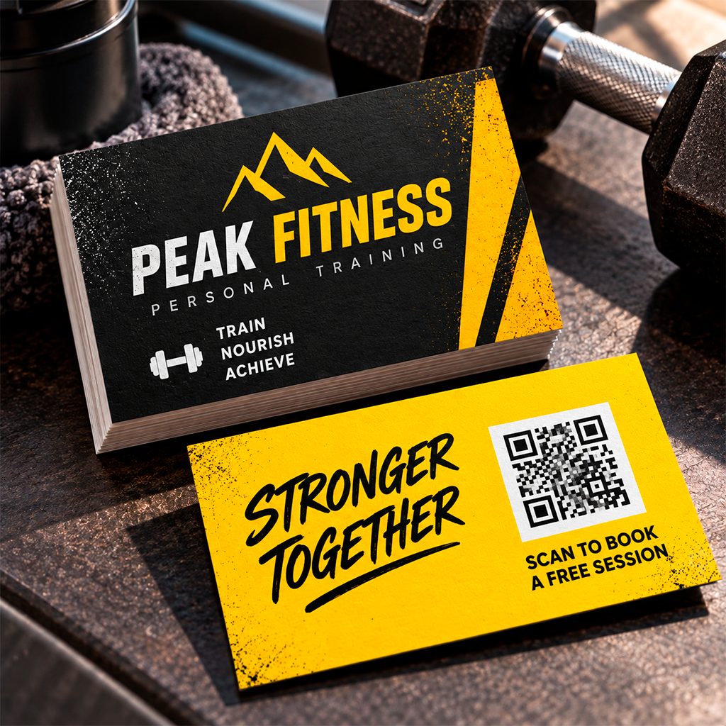
One strong brand color, an oversized name, and minimal text. Works well for creatives, salons, and trades.
03 / LESS IS MORE
Minimal
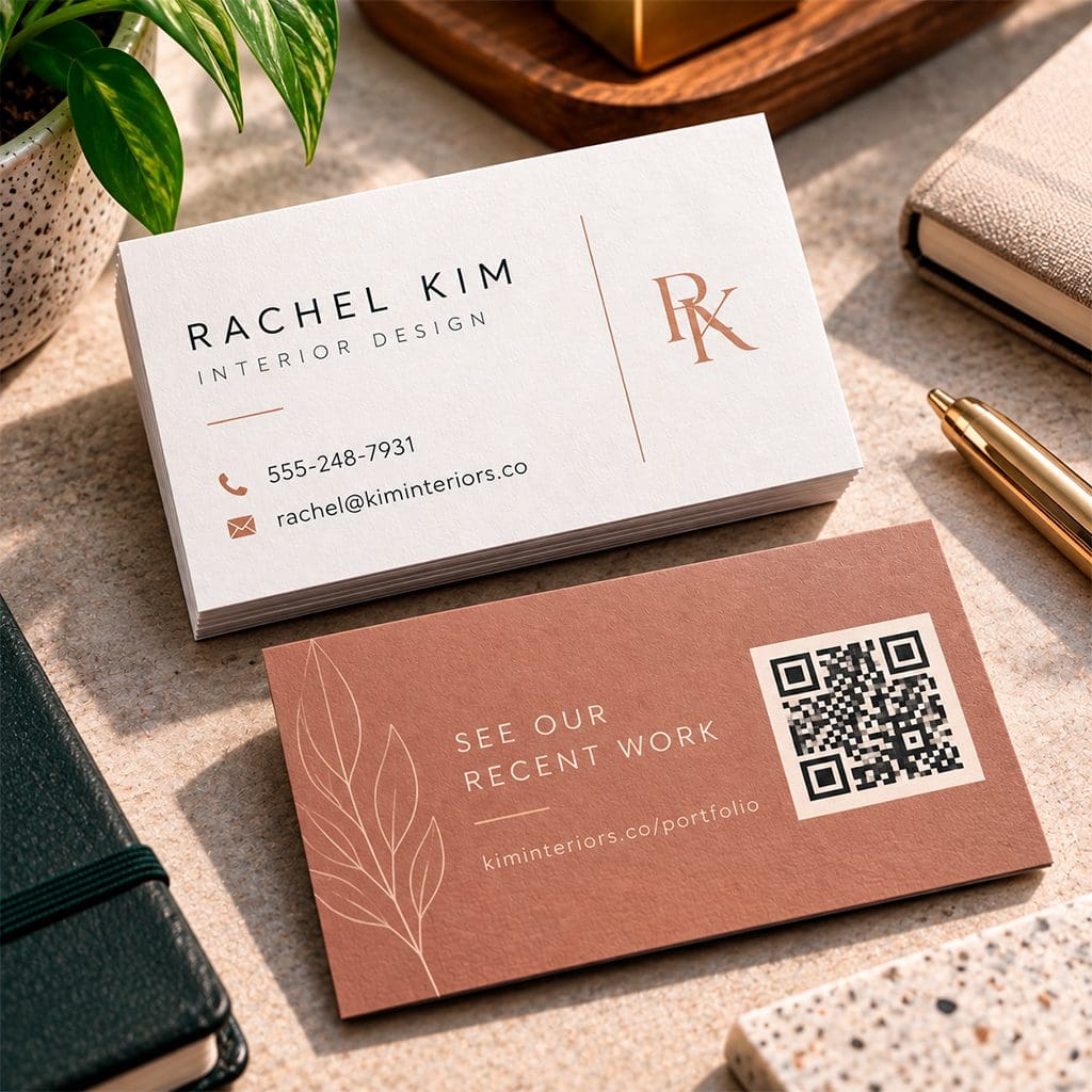
Name and one contact method on the front, with a QR code or offer on the back.
Keep the structure but change one thing, such as the color, the size of your name, or the offer on the back, so your card doesn’t look like everyone else’s from the same template.
Whichever you choose, start from a printer-made template so margins and trim lines are already set.
Browse 215 Prints’ business card design templates and start your order or explore our full range of printing services to keep your brand consistent across flyers, postcards, and more.
For more layout inspiration, see our roundup of 11 design ideas for business cards.
CTA examples
Every card needs one clear next step, ideally on the back. Adapt these to offers you actually run:
ONE CARD. ONE ACTION.
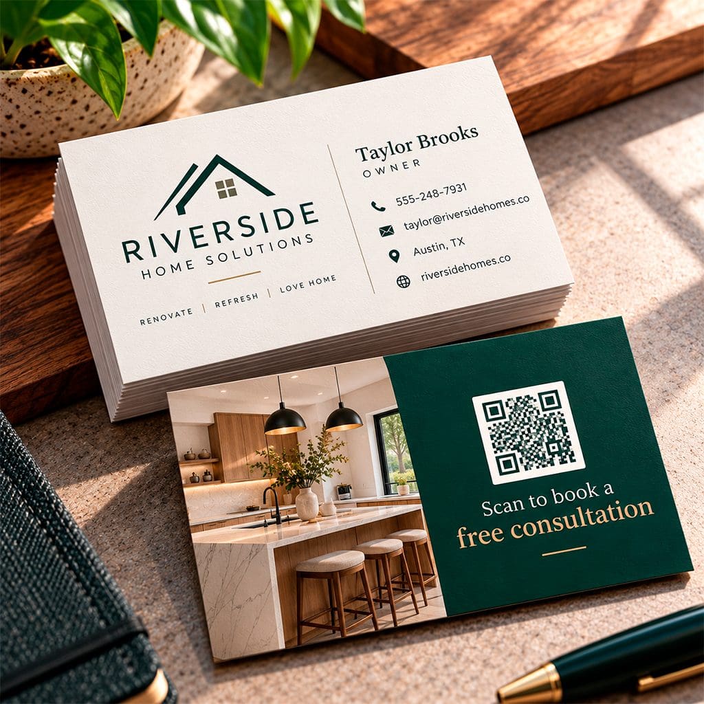
“Scan to book a free consultation”
“Mention this card for 10% off your first order”
“Text a photo of your project for a quick quote”
“See our recent work: yourwebsite.com/portfolio”
Keep it to one action. Two competing prompts split attention, the same reason a good A-frame sign carries a single message. Our guide to advertising with an A-frame sign covers that in more detail.
Put the action on the back in your largest secondary type. If you use a QR code, make it big enough to scan reliably, with a clear border around it.
Test the code on a printed proof before you order the full run.
How to measure your business card ROI
Published “average ROI” figures for business cards rarely trace back to a primary study, so your own numbers are the ones worth trusting.
The good news is that a card is one of the easier offline pieces to track.
STEP 01
Start with the cost
In 2026, 215 Prints estimates a starting price of $56 for 25 cards at the standard 3.5″ x 2″ size, for its 14pt Business Cards with a UV high-gloss coating. Check the current price for your own stock, quantity, and coating.
STEP 02
Tag every batch
Give each print run or event its own QR code, booking link, or “mention this card” phrase so you can see which cards actually produce scans, calls, and orders. Ask new contacts how they found you, too.
STEP 03
Log the follow-ups
Keep a simple sheet with the event, the date, the cards you handed out, the conversations that led to a follow-up, and the customers you won.
STEP 04
Run the math
ROI = (gross profit from card-sourced customers − card cost) ÷ card cost, where gross profit is revenue minus the direct cost of delivering what you sold.
THE BREAK-EVEN TEST
How much does the card need to earn back?
Because a run like the one above costs so little, break-even is a low bar: any new customer whose first purchase earns you more gross profit than the order price has already paid for it.
Review your sheet after a quarter, then adjust the layout or call to action and test again.
A strong business card is a compact sales tool: legible, well finished, and built around one next step. Print it well, keep the layout clean, choose a template that fits your brand, and give people one clear thing to do. Then they have a reason to remember you next week.
Ready to make yours count?
Explore professional business cards from 215 Prints → and start your order today.